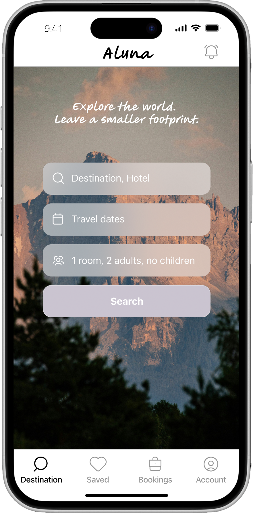
Aluna is a mobile app for booking sustainable stays that actively reduce their footprint. Designed end-to-end, as part of his UX Professional Diploma, the product focuses on removing friction from search to checkout. Built on usability findings, the design evolved through journey mapping and sketches into a clear, high-fidelity prototype. The result is a calm, clear booking experience with visible eco criteria and transparent pricing.
The approach
Identifying friction points through usability tests in the hotel booking experience.

Analyzing insights through affinity mapping:
Observations from usability tests were captured on individual notes and grouped into themes to identify recurring patterns and core usability issues. Key pain points identified:
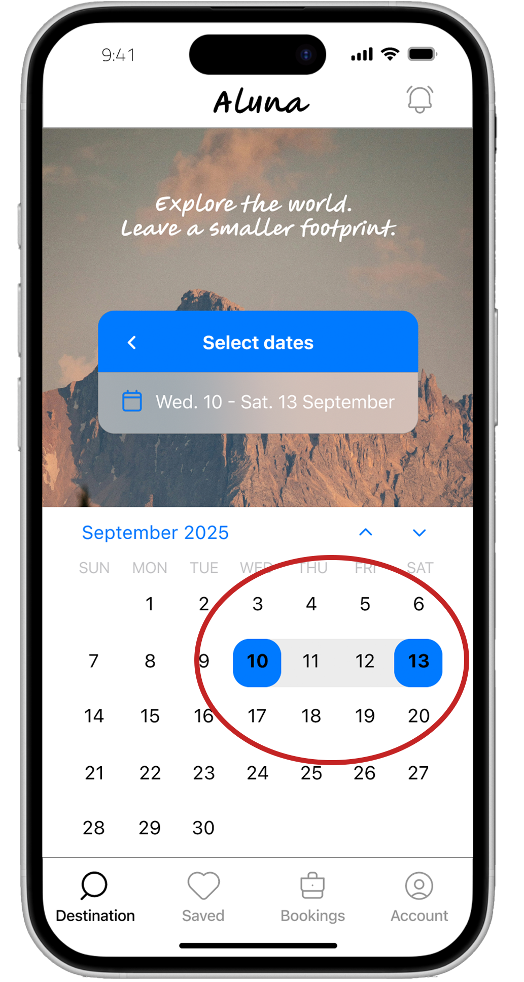
Friction in selecting travel dates
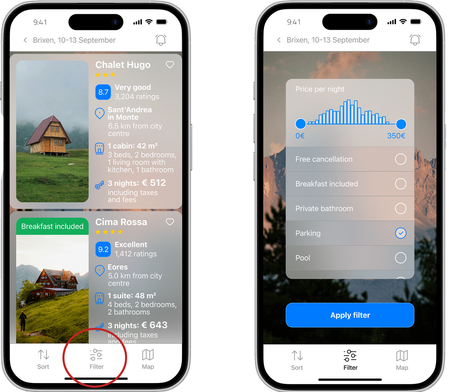
Filters were difficult to locate
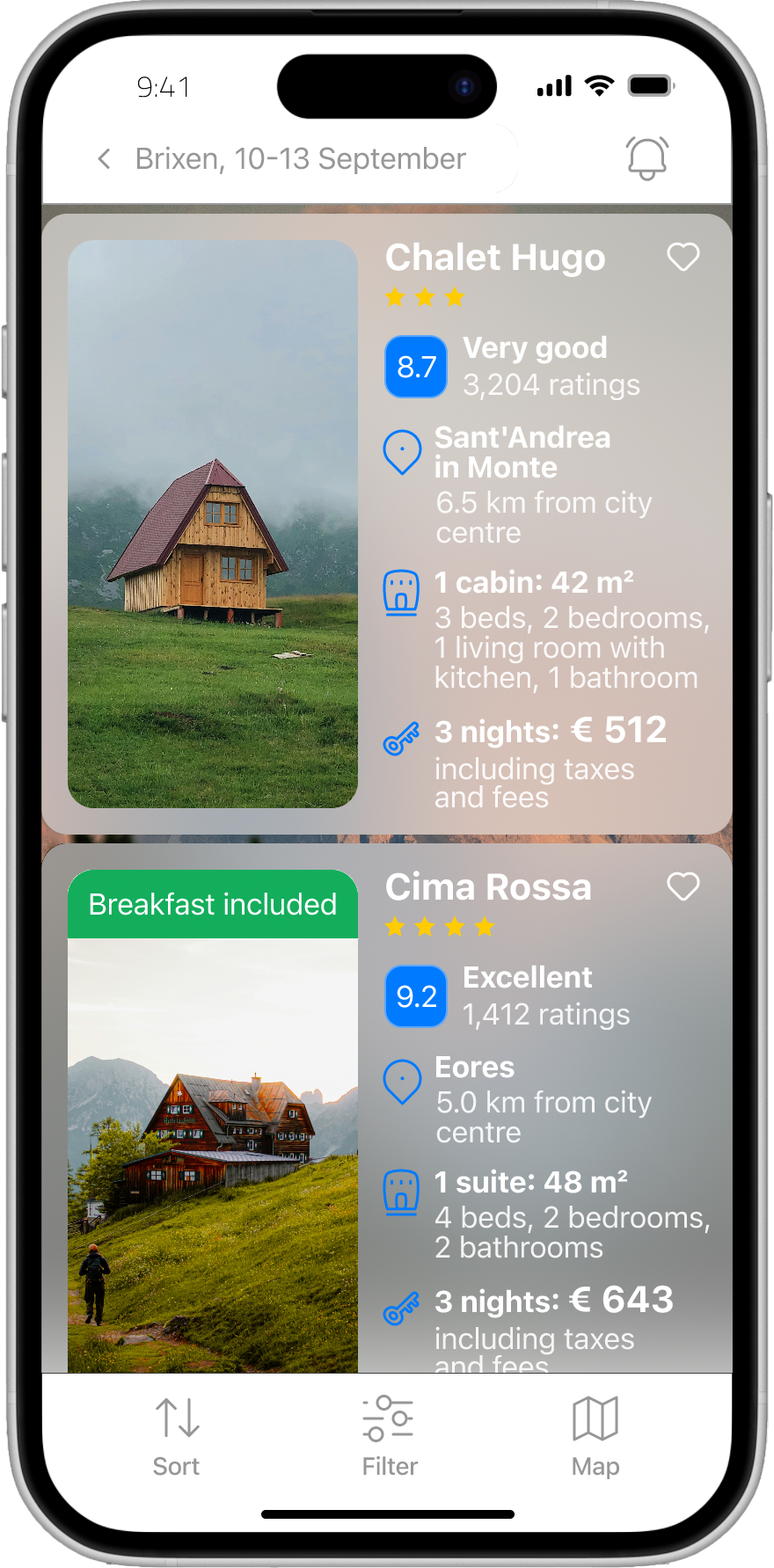
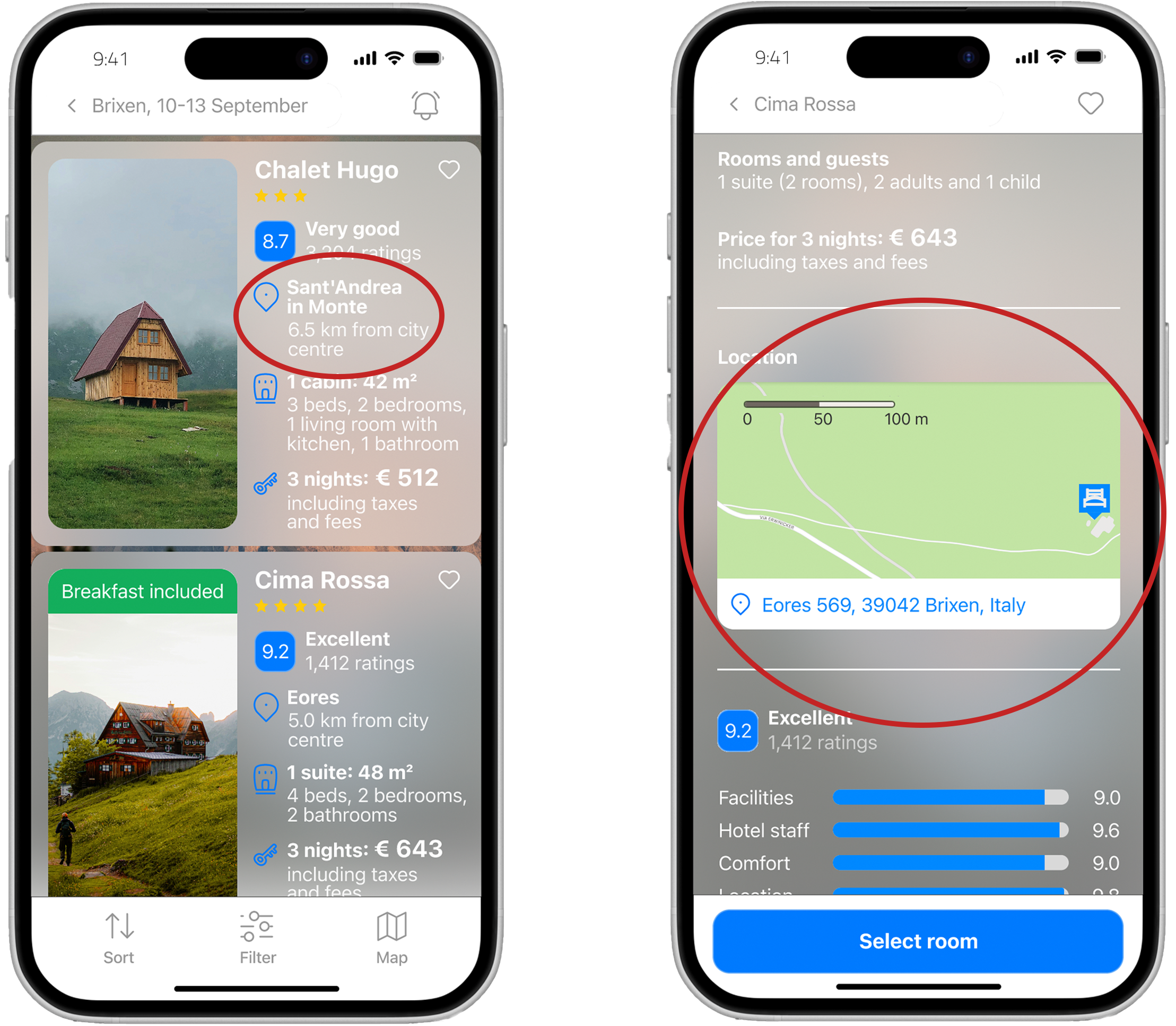
Hotel details lacked clarity and structure
Hotel location was not clearly indicated
Payment flow felt confusing and unclear
Translating insights into a customer journey map:
Based on the usability test observations, a customer journey map was created to visualize user goals, mental models, behaviors, pain points, positive moments, and emotional states across each stage of the booking flow.
View the the customer journey map.
User flow along the „happy“ path:
The booking journey was redesigned using a structured flow diagram that defined key interactions and screen states. As a result, the updated experience introduced clearer forward paths, reduced the number of steps in high-friction moments, and surfaced essential information earlier in the process.

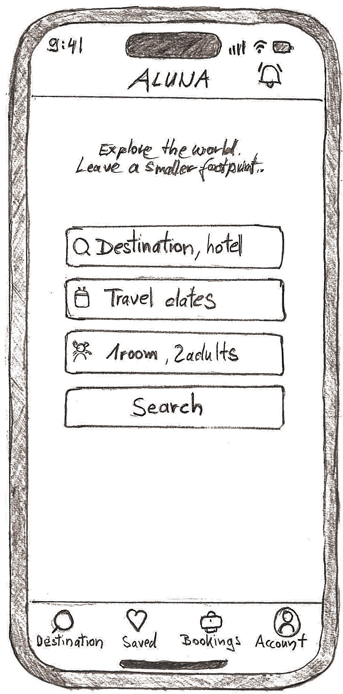
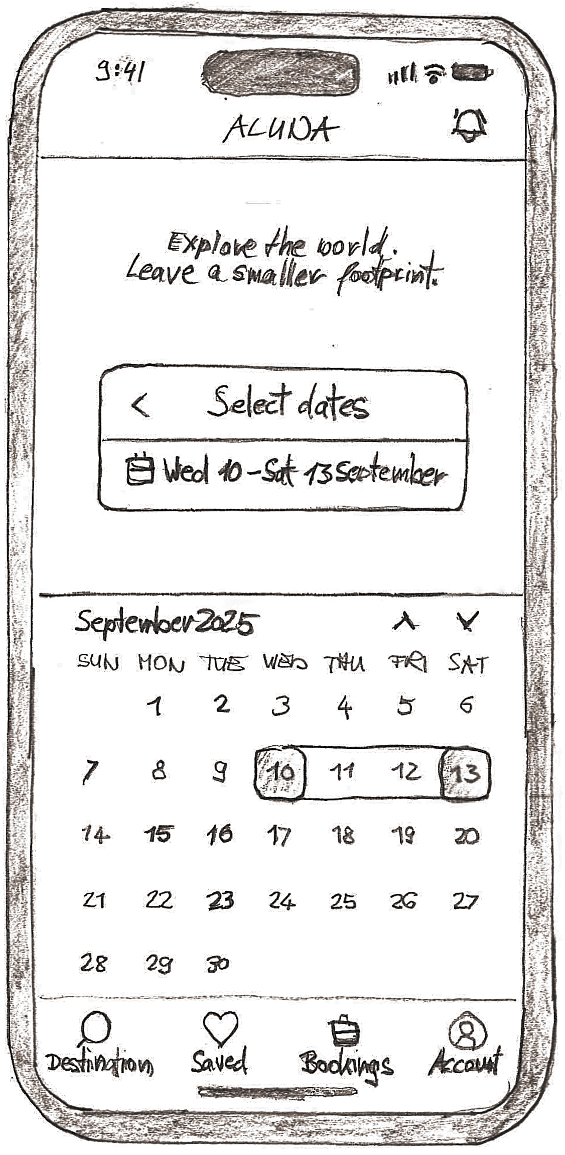
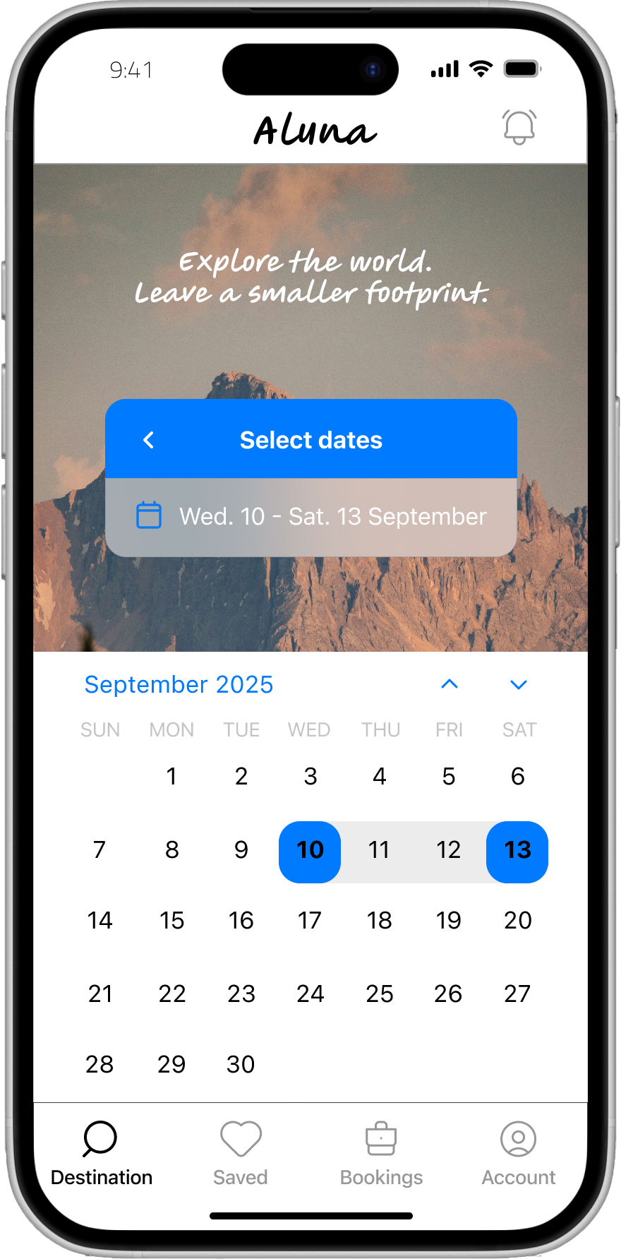
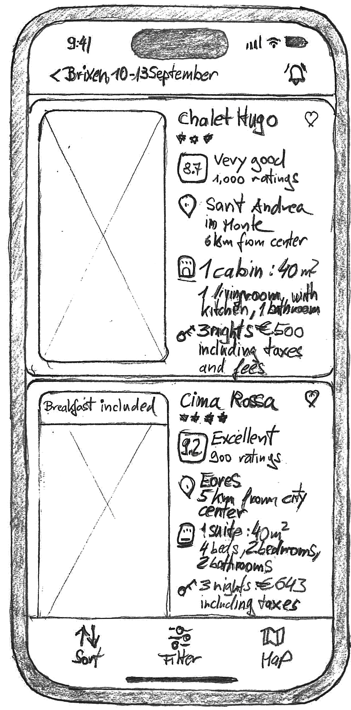
From paper to pixels:
Early ideas were explored on paper and translated into high-fidelity prototypes.
Tap the images to view the high-fidelity versions.
Hover over the images to view the high-fidelity versions.
Based on the identified pain points, the following design question emerged:
How might we reduce frustration in selecting travel dates?
Larger tap targets, live range preview, disabled invalid dates.
How might we make essential filters easy to find?
Top-level filter entry, sticky filter chips.
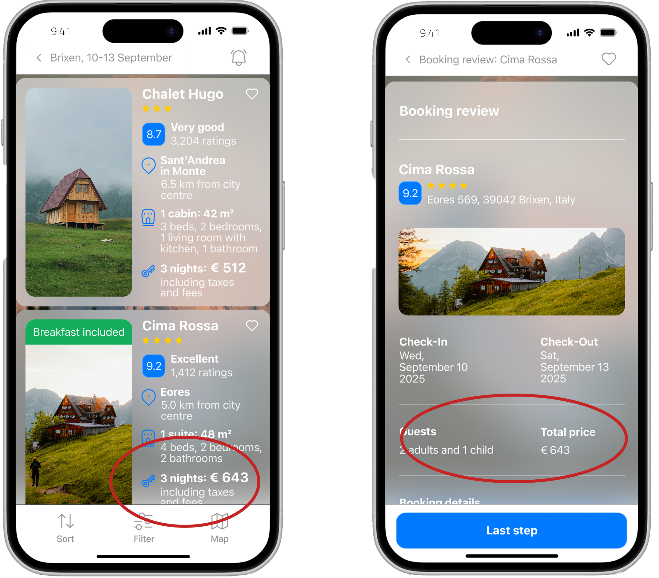
How might we present the right details at decision time without overload?
Concise highlights.
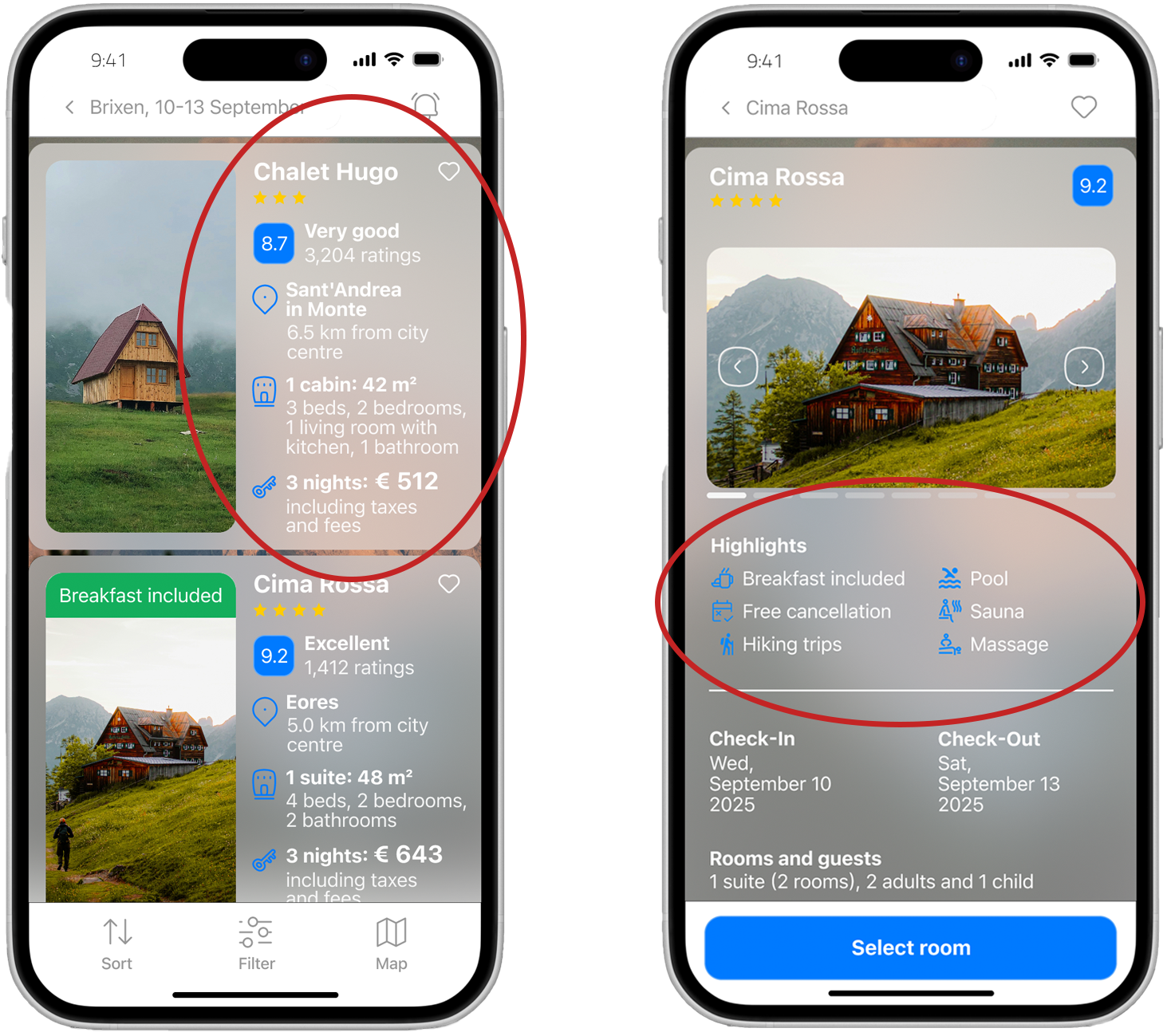
How might we help users quickly find the hotel location without interrupting the booking flow?
Inline mini-map, distance/time chips to landmarks.
How might we clarify total price and refund rules before checkout?
Up-front total with fee breakdown, consistent price across screens, refund preview.